Trial and error.
Who would have thought? I mean, type design looks tedious enough, but having tried it? It’s hard.
Some years ago I embarked into making my own font, it’s called tram. I should say typeface, it is the proper term after all, but since I only managed to draw up one weight, one size, no bold, no italics and no nothing, just “font” will do. It’s already a miracle that I could make both the lower and the upper case.
I started without any concept, reference or inspiration, so I conjured an “automatic” workflow: pick a random pen, strike some reference rules on the page, get to drawing, and see what happens.
This is what I ended up with: a dip pen with a very sharp and flexible nib, a template to draw rules on the page, and some hundred glyphs to pick from for digitizing.
This is probably not the proper approach to font design. Or any sort of design, really.
Trial and error.
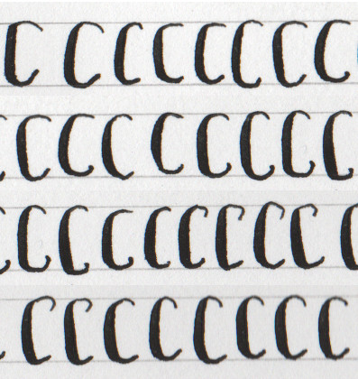
Nevertheless, using such a picky tool as a dip pen gave to the font some actual style and consistency: you can’t just make any stroke you want with a dip pen, you are restricted to some sets of line widths and directions.
After deciding which glyphs had made the cut, it was time for digitization. All work was done in FontForge, which is free software. I followed very closely the instructions in the online book Design with FontForge, as it gives noob-level lessons both in the theory of type design and in the use of FontForge.
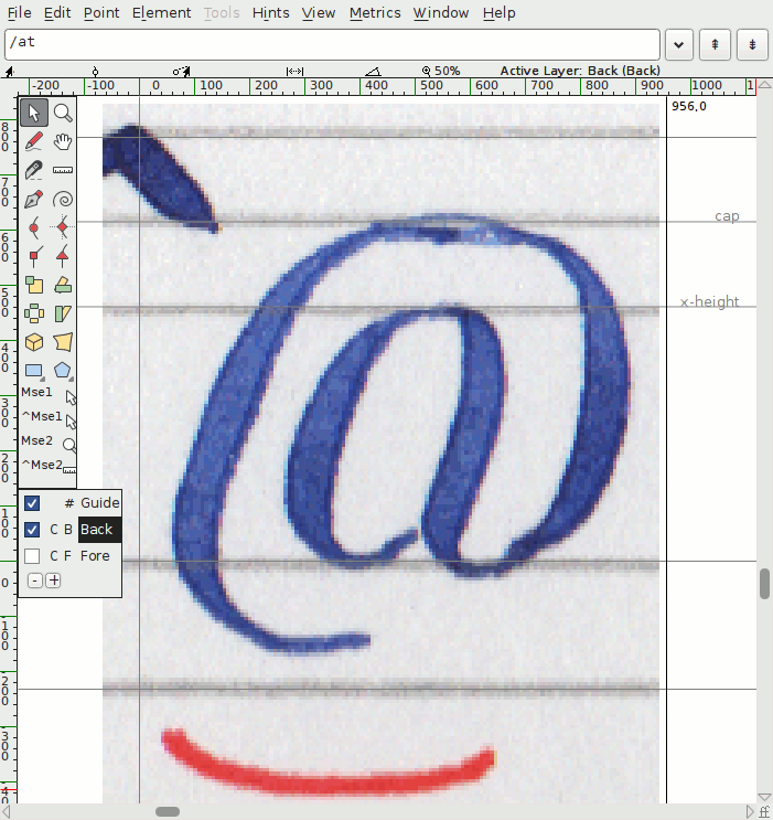
My point of view in FontForge: do this times a hundred, and your font is done.
The latest (and possibly the last) version of tram has the lower case, the upper case, oldstyle numerals, some symbols, and some diacritics. Most notably, tram is missing parentheses and braces while sporting a fashionable manicula.
I’m quite fond of the uppercase, it has potential as a big display typeface. The lowercase however is all over the place, it has very inconsistent weights and shapes, giving it poor legibility at all but the biggest sizes.
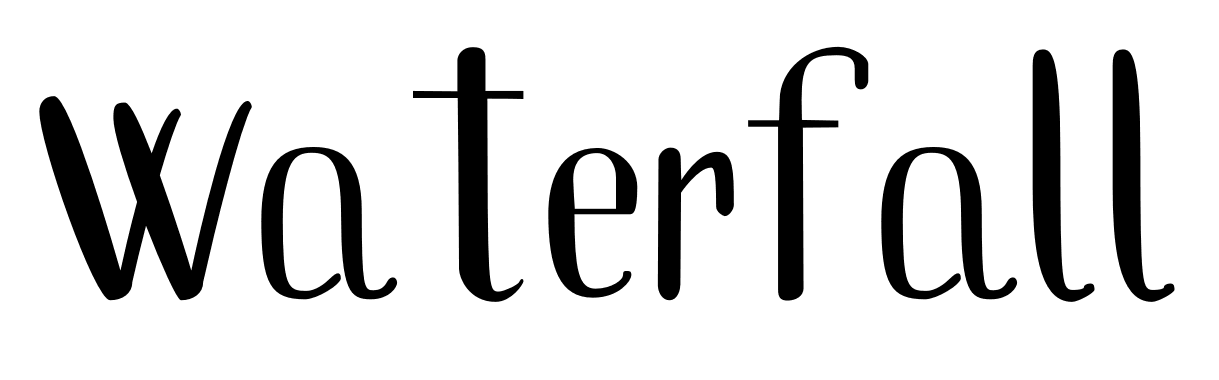
The effect of kerning.
Did you really think this is all there is to type design? Oh, poor you… Poor me, actually. After digitizing all the glyphs I discovered a grave truth: you can’t draw your characters one by one and expect that they will look good together!
And so started the tweaking, fixing, kerning, tuning to make words, not just single characters, look good. These last steps are as crucial as they are painful.
Ultimately, this is where my design fell flat: the lack of planning from the start had me doing something closer to redesigning than tuning.